
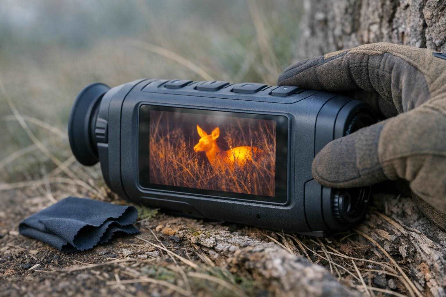
While a good thermal optic can easily reveal animals for us, the images they provide are often too vague to determine with certainty what we are looking at. In some cases even quite distinct heat signatures don't provide enough information to determine with certainty what we are looking at. Other thermal images of identical animals of the same species appear to reveal far more detail of the same subject animals. This is not because one thermal optic is better than the other but because the images have been presented in different ways. The way a thermal image is presented is determined by the color scheme used to display the temperature information in the image. As with so many things, choosing between thermal image palettes is a very practical matter related to the purpose of the observation, the background and the amount of information in the image that needs to be preserved.
Start with the scene, not the color menu
Different temperature difference presentations on the screen are created by different palettes. They do not add any detail that the sensor has not captured and do not identify animals in vague heat signatures. Contrast, wearer comfort and the speed of wearer's heat signatures detection are what a palette can change for you.
The image analysis one is trying to perform greatly determines the choice of image presentation. Field observation in open situations versus in close cover is a good example of this. High contrast palettes are very good for detecting movement, and then a less contrasty image can then be used to analyze the surroundings in great detail.
Many " thermal image palettes" can appear very impressive at first when scanning through scenes quickly, but after longer periods of observing animals these can cause eye fatigue.
What the common palettes emphasize
White hot displays temperature by brightness and therefore warmer areas appear brighter. Black hot displays temperature by brightness and therefore warmer areas appear darker. Both of these palettes are best for quick scan viewing as they create simple images with few colors to view.
There is no right or wrong answer between white hot and black hot as they can be both viewed in positive or negative light depending on the individual. The main thing to note is that both thermal image palettes will highlight objects in your scene in different ways. It is suggested that you try viewing a stationary scene with both white hot and black hot thermal image palettes to see which you find easiest to view for detecting edges and movement.
By adding colors to the temperature data of thermal images, so-called color palettes can be created. These palettes can emphasize warmer parts of an animal's body by painting them in red, for example. The iron-palette, for instance, looks particularly good at small warm points such as an animal's head, ears or tail. In addition to these advantages for image recognition, however, the extra colors also add to the overall amount of information in the image.
The Rainbow/Seasmith style palettes have been chosen to emphasize the small temperature differences in order to show the thermal variation in the scene. However, this does not necessarily mean that they are the best palettes for wildlife observation. Try to keep the palettes simple in order to get the best view of the animal's outline and position.
Detection and recognition are different jobs
While "is there something there?" is a good first question, "what does it do?" and "where is it?!" are different questions. We can change palettes for these questions.
First use a setting which displays a good contrast between the heat signal of the moving animal and the background. A simple black-hot or white-hot setting is best for scanning large open areas like fields. Once you have found the animal switch to a more structural display and look for warm patches on the animal's head, body and legs. Remember that the colors show the temperature differences and the structure of the animal's body.
Remember that a good thermal image does not look the same as a good optical image and does not even look the same as a good thermal image of a different species or of the same species but of a different age or sex. Use the image for what it is – a representation of the infrared (heat) emissions from the subject and its surroundings – and do not attribute characteristics to the image that are not there.
Use contrast carefully around vegetation and sky
Take into account the background temperature when working with scenes with a lot of contrast in background temperature. Scenes with a subject on a cool background will generally be visible in most color palettes, whereas scenes with warm background objects (rocks, buildings, etc) or strongly temperature contrasted backgrounds (dense vegetation etc) will benefit from the use of contrast.
Looking at backgrounds with many small temperature changes can be very distracting. A simple colored mode may be less distracting than a temperature mapped mode. For small objects a transition of color on the object can help finding it when slowly panning over the scene.
A shiny surface of a recently exposed patch of ground, the heated ends of branches etc. can be mistaken for warm patches on a living animal. This is especially true when the animal is small. Check the area out in a different color scheme, change the focus to see if there is any sign of life and look for movement.
Build a simple field workflow
Use the same procedure each time you go out into the field. Use the same display setting as your starting point (e.g. the white-hot setting with the minimum amount of contrast). Focus the optic and then give your eyes time to adjust to the display. When scanning for animals, scan slowly and give particular attention to changes in the background pattern of temperature. You will often notice an animal by an interruption in the background pattern of temperature.
Even after you have found an object in an image hold the view steady for a few seconds and test another display mode. Does the object still look like the same object of observation? Have the contrast and temperature of the object changed dramatically? Does the object still move as expected? Many different display modes are useful for cross checking a single image of observation.
Save your preferred settings for the most common use cases: scanning open spaces, scanning woodland edges, scanning densely vegetated areas. This way you can save time when working in different environments and won't have to wade through all the settings every time.
Know when the palette is not the problem
You may still get an unimpressive thermal image, even after you have experimented with all different palettes. It's possible that a combination of factors (such as poor focus, a wrong magnification, a dirty window, atmospheric conditions or even that the subject is too far away for the optic to resolve) could render an image unimpressive. Also, much as you can increase the amount of sharpening and contrast on a digital image, the resulting image will not have added value.
I would suggest turning down all digital sharpening and reducing the overall amount of contrast adjustment to observe the thermal image in its simplest form. While it's tempting to improve the appearance of the image, it can often lead to misidentifying features of the observed wildlife. Reduce the digital sharpening to the lowest setting possible, and also turn down the contrast. The images will look poor, but much easier to observe and to describe.
Choose consistency over visual drama
Use simple high-contrast palettes for wide area surveys and experiment with color on small subjects to enhance contrast. Later switch back to a simpler view should the image become too 'noisy'. Compare different palettes on the same scene and remember to switch focus and background too. Use movement to confirm unusual shapes and views of the same scene.
The most important thing is to aim for the most simple, high contrast image to help with identification and observation of wildlife. Don't confuse the most colorful image with the best!